After meeting my "client" (assigned classmate), she explained to me the lack of time she had for several encounters so I prepared myself to be time efficient, and clear and concise with additional questions that could eventually emerge.
I was fortunate to receive the completed briefing handwritten, as this gave me extra information about my client choices. Her brief was quite detailed and familiar to me, because I was a teenager in the 80s and I lived the "culture" she was mentioning. The memories of my personal experience during the chosen period of time made me feel comfortable with the requirements to construct the GIFT BOX.
First, I underlined the elements I wanted not to miss in my design. Due the small size of the gift box, clearly I had to analyze what items of the brief to exclude and evaluate the consequences of the curation.
I spent a couple of hours researching the underlined keywords and I created a digital moodboard. The first intention was to inspire myself and then I thought it was a good idea to have it as a conversation with my client back up. I wanted to see the "big picture" of the time-period so I organized some of the images by colors to get a feel of my future design.
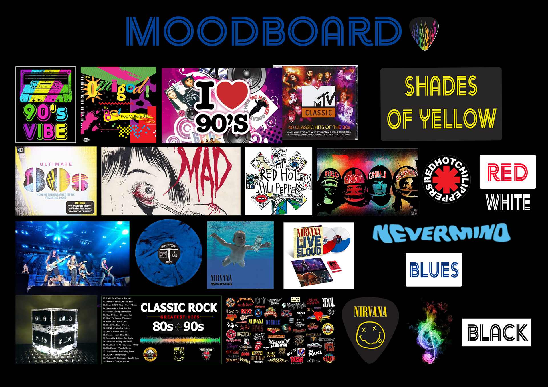
As a reflection, I can say that I have used digital mood boards in the past, when designing book covers for a client and they worked really well to choose colors, textures and fonts and even to talk about layouts.
I never used hard copy boards but I believe they are definitely a fun thing to do. I think it takes a lot more time than a digital. Although, if sometime I have to design a product for outdoor purposes, I will be taken textures from the surroundings to be inspired by, as well as pictures and sound recordings.
After reading the brief many times, I realized that she repeated some words a few times: DARK, COLORS, POWER and its word family EMPOWERMENT, POWERFUL, REBEL...
I thought those concepts were essential to be represented in the box.
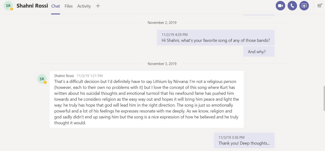
To impact in her emotions I asked her about her favorite song of any of the bands she had mentioned. Her answer was quite philosophical and surprised me. "Lithium", by Kurt Cobain, from Nirvana.
When I went back to the brief, I noticed that she had mentioned "Nirvana" in first place every time she named musical groups. So I thought it must be included. In the opposite street was "Bon Jovi", only mentioned once. If I had to exclude something that was going to be it.
The video shows extreme cases of rebellion, power, and strong effects on the public.
I printed the computer screen while I was watching it and I used Adobe Photoshop to manipulate the image of the singer and song-writer to be the highlight of one main side of the gift box. I completed that part with the band logo and a rainbow pentagram that covered one of the narrow long sides.
Below, and working as a title of the second main side, I put what I considered the most powerful line of the lyric: "we have broken all the mirrors". I was not satisfied with the font choice simulating neon lights, so popular in the 80s and 90s. Although, my client approved it so I didn't do any further research.
On one of the smallest sides, I put the name of the album where the song was first introduced: "Nevermind", as it appears on the CD cover artwork.
Below are the photos of the finished Gift Box to use as reference of the comments.
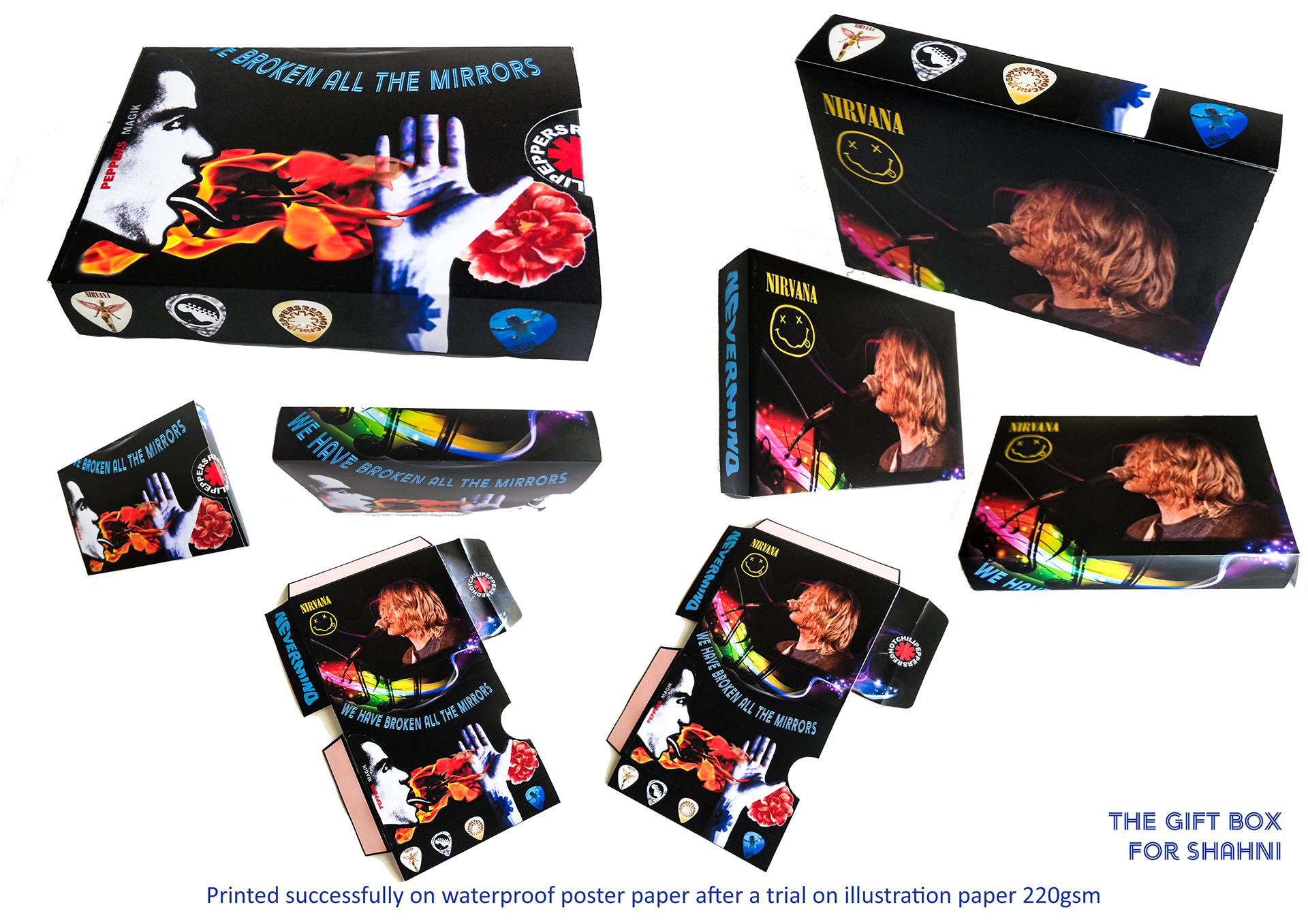
The second main side was dedicated to Red Hot Chilli Peppers Band. I made a collage in Adobe Photoshop with images of the album covers: the portrait, the hand and a flower. I tried to convey the concept of rebellion by adding fire to the portrait, raising the hand on the flame, and placing a flower behind the hand.
Following the semi-circle shape of that side of the box, I placed the RHCP logo in a way that once the box was assembled, the logo gives a sense of perfect closure. Also, it works as ending of the rainbow waves.

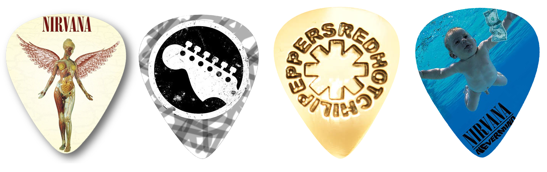
To finish it, I thought the guitar picks are the typical fetishist object that everyone wants to get when attending to a concert, so I placed four of them in the last longest narrow side of the box.

My customer was happy with the Gift Box and I felt that we had a shared vision of what I was trying to achieve: a keepsake for special memories with iconic images. Although she wanted rebellion to be represented, the box had to look clean, not cluttered, not pixelated and impressive. She thought it was very good.
Client relationship was relatively easy to establish. At the beginning of the Course I had to wait three weeks until my customer returned the brief but after that the whole process run smoothly, probably because she put a lot of effort in explaining to me the ideas she was after.
From my side, I tried to ask her the right questions and I studied the brief deeply before contacting her.
Personally, I find that clients that are indecisive are the most challenging people. At work, everyday I deal with these type of personalities and I need to be very patient not to feel frustrated. Now I learnt that there are many ways to deal with this issue: agree on a brief where the project is defined, use mood boards to help the client making choices, design quick mock-ups to understand if we are in the same page and also sketches can be really useful. All these means of conveying an idea do not supposed to be time-consuming.
Fortunately, I've been dealing with customers for 30 years! and only two times I got exhausted with my client's demand of changes and I had to walk away and quit all wishes towards perfectionism.
Other issue sometimes I had to deal with (but not often) was unprofessionalism. I still talk to a couple of unprofessional clients and I must admit that I've felt the temptation to talk in a "more casual" tone but I found that this unprofessional behavior played against me, especially when I had to present a problem during the ideation process. Better to use standard English, write extensively from salutation to regards and be concise and clear.