AESTHETICS
Aesthetics as a discipline was baptized by a Leibnizian philosopher, Alexander Baumgarten. Leibniz’s notion of beauty coincides with the Pythagorean view that beauty is related to harmony or ‘unity in plurality’, a principle of order. Something is beautiful when is constituted by many elements that are united, independently of any subjective judgement. For Leibniz, the world and nature were created by God following this measure, and therefore they are objectively beautiful.
On the other hand, variety is a multiplicity of things or representations. According to Leibniz, whenever we perceive something that exhibits unity and variety, we experience pleasure and this is the relation with subjectivity. ‘We seek beautiful things because they are pleasant".
Years later, in "Resumé of Metaphysics" (1697), Leibniz inverts the formula to define pleasure: ‘An intelligent being’s pleasure is simply the perception of beauty, order and perfection’.
Portales, Carlos. "Objective Beauty and Subjective Dissent in Leibniz’s Aesthetics." Estetika: The Central European Journal of Aesthetics LV, no. 1 (2018): 67-88.
Reflecting...
Aesthetics seems to be a complex concept that helps us to understand the wave or movement of an artist or group of artists that have defined what is pleasant and what is not, according to the appareance of something and not necessarily stands on the beautiful side.
I'm thinking of the Dadaist aesthetic, for example, "where the focus of the artists was not on crafting aesthetically pleasing objects but on making works that often upended bourgeois sensibilities and that generated difficult questions about society, the role of the artist, and the purpose of art" (The Modern Art Inside, 2020, https://www.theartstory.org/movement/dada/)
Personally, I find that in design something is appealing when it has a surprise effect; when something surprises me because it's meaningful, crafted in detail or its opposite, extremely simple as a one line drawing that perfectly represents its real being. According to my mood, I find pleasant vibrant colours as much as pastel, soft colours that bring a sense of tranquility. I enjoy the texture that nature brings and I like to see them in different objects of design, like furniture and fabrics inspired by nature.
I have an interesting story about sharing a different opinion from my husband in relation to aesthetics. I very much like the colour green, as a green leave, not too light, not too dark... I ask him to paint the back wall of our bedroom in that inspiring green. He first thought was too dark (compared to white, maybe) and then he was completely sure it was the last colour he could probably choose for a bedroom. Anyway, one day I had enough courage, I went to buy a sample of the paint and I painted a good brush stroke next to my side of the bed. He didn't say anything but "mmm..." That gave me the clue that I should probably get a litre and see what happens. So I did. Long story short, after 8 months, one day I came back from work and he had painted the wall. I was so in love with it! (and him!, for understanding the challenge) I asked him about his thoughts and he said "I never thought such colour could be any good for a wall, but I must admit that is really cool". Sometimes we just need to experience with colour away from prejudices.

Chromophobia
What a book! Batchelor analyses in detail and with many examples of the history of Literature, Fine Arts, Film-making and Architecture, the phenomenon of Chromophobia or the fear of colour.
Interestingly, philosophers, artists, art historians and cultural theorists, have contributed to see COLOUR as synonym of contamination and corruption since the Ancient Greece. For example, Aristotle wrote in "Poetics" that 'a random distribution of the most attractive colours would never yield as much pleasure as a definite image without colour' (cited by Batchelor, 2000:29).
It seems that discrimination and prejudice about colour started right there. If drawing was related to order, colour was to chaos. Later on, Academies reinforced these ideas until the 19th Century when they collapsed.
During the 60s, the 'drug culture' was associated with the distortion of forms and intensification of colour. Writers like Barthes investigated profoundly the phenomenon of COLOUR. He describes its power to overwhelm and its eroticism. Also, Huxley writes a book about his experience with mescaline. He believes that colour is "intrinsically meaningful" (P.33). Throughout the experience with colour, he recovers his innocence and feels a flow of perception that reverses the order of things, 'the conventional hierarchies of thoughts". Colour, for Huxley, means Eden.
I enjoyed taking notes of Chapter II of "Chromophobia". Some years ago, I studied Literature and now, reading this text, it was so interesting to add more information to my prior knowledge! I never thought of COLOUR as an "object of extreme prejudice in Western culture" (P.21).
I was also very excited to read about a movie that really caused a great impact on me when I was a teenager, "Wings of desire" by Wim Wenders. I remember the angel trying to understand what's going on on Earth and concluding "we must recover the affectionate look to life"... or something similar. The idea of the need to recover the innocent look to life. The movie impacted me forever. In "Chromophobia", Batchelor analyses the use of color in the movie, for the sensuous world (world of desire, consciousness and self) and the monochrome choice, for the spirits and angels world (P.36).
Despite of analyzing other movies, Batchelor pays special attention to the work of Le Corbusier, an European architect, designer, painter, urban planner, writer, and also considered a pioneer of modern architecture. It seems he had two different periods in relation to the experience with colour: before and after 1925. Before, he travels to Orient and he writes "Journey to East", in which he understands WHITE as a precondition of colour. White is co-dependent and co-operative. Orient is seeing as an explosion of color that intoxicate and makes you dizzy.
After 1925, (post Great War), Le Corbusier finds order, reason, purity and truth through the concept of WHITEWASH. He pursuits the perfection of the PURE WHITE, synonym of clear, clean, rational and healthy. These concepts are expressed in 'The decorative arts of today', a book about architecture. Surprisingly, he only made one white building. White was more "a myth, an aesthetic fantasy"(Batchelor, 2000:47).
In collaboration with Ozenfant, Le Corbusier explores colour even further. In the 'purist universe', colour is a problem that must be controlled, ordered and classified. There is a clear rethorical subordination of colour to the "rule of line" and "to the higher concerns of the mind". COLOUR is now something "learned, ordered, subordinated and tamed". It's not longer "intoxicating" (P.49).
For more details, see Batchelor, David. Chromophobia. London: Reaktion Books, Limited, 2000. ProQuest Ebook Central.


Reflecting...
Batchelor's text opened my mind in a way that I will always be grateful. As a designer I feel more free than ever before to experience with color, just by being aware of the cultural perceptions of color and its consequences throughout the history. Many artists felt the need of experiencing explosion of colours as well as the 'purism' of the white. As a designer, I feel I need to feed my curiosity with experiences that not necessary follow the traditional color theories or Le Corbusier's scales. In the near future, I expect to take risks when blending colours or making compositions, follow my intuition to see where it takes me, make mistakes as much as I need, and challenge myself, even in front of other's discrepancies. After all, to me, colour has always had a POSITIVE value.
Purnell (2013) says: " White is great when it’s a color amongst other colors, but when it’s meant only to contain, suppress, and keep other colors at bay, you may want to resist its temptation".
Bubbles, lines and string:
How information visualization shapes society
Visualization can be organized in three categories: Scientific, journalistic and artistic.
Examples of visualizations can be found in infosthetics.com and visualcomplexity.com.
Drucker, in "Humanistic approaches to the graphical expression to interpretation" (2010), thinks that the visualizations need to carry some critical discussion about who made, for whom and for what purpose.
I thought the visualizations are a great mean of communication in our visual era. Designers have to develop many skills to produce them, such as analysis and synthesis. The designs can be very complex, although, the aesthetic of a design is not as important as its power of conveying the right meaning.
Critique
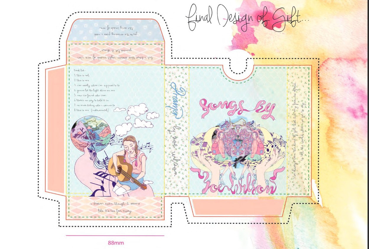
"Songs by Zoe Wilson" gift box it's aesthetically pleasant.
To me, it's a keepsake of maybe favourite songs written by a young lady. Nature seems to be her inspiration and this is beautifully represented by the walk path with musical notes on it coming from the mountains.
I very much like the idea of the hands in a given position, like saying "this is my world, it's now open to you". On one hand, a purple pentagram with pen and books. On the other hand, a traditional black but wavy pentagram with musical notes. The young lady is mirrored, conveying the idea of complexity, duality and reflection.
The lady's hair is quite long, colorful and intricate, probably a representation of her colorful and extensive dreams. Dreams that are fully supported by four halves pastel yellow moons. Everything in the design is soft, it delivers a sense of wellbeing by doing what she loves the most, to be a musician.
The patterns of the background simulates naive fabric patters. They convey the innocence through the repetition of little cute flowers, or harmony with the diamante shapes. The formal elements support the conceptual ones.
A great addition to the design is the ribbon drawing the title of the box. Even though her name is difficult to read, we find her name clearly written in the side of the box. The font choice for the song list and the sides of the box I must admit is one of my favorites. It promotes a sense of continuity from the hand drawings to the hand writing.
Maybe the font chosen for "Dreamer" is not what I would choose. I rather have just the other two fonts to keep all the ideas in handwritten.
Another issue that I found is that the font sizes are far too small. I can not read them and that's very unfortunate. If I amplify the image by 300%, I read it and what it says is emotionally touching and interesting.
I believe the intended audience is the song-writer herself and she probably loved it. To me is effective, meaninful, creative, touching and aesthetically pleasant.
Finally, the presentation of the design on watercolor painted paper adds a fresh "watery" touch of color and